Objective
The goal of this project was to redesign the dressing bottle for Theo's Neighborhood Pizza, a Pizza Company Based in New Orleans, Louisiana, in a way that improves shelf appeal and communicates the brand’s identity more effectively. The design needed to balance strong visual branding and a distinctive look that stands out against competitors.
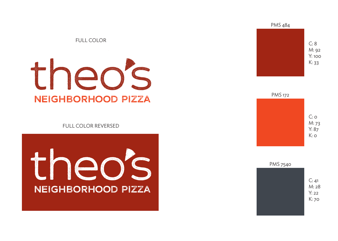
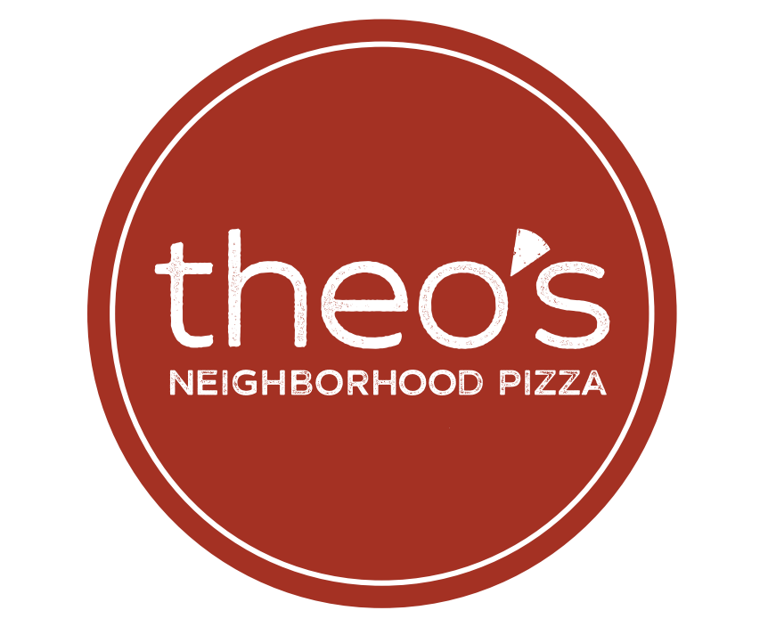
Visual Guidelines
Sketches
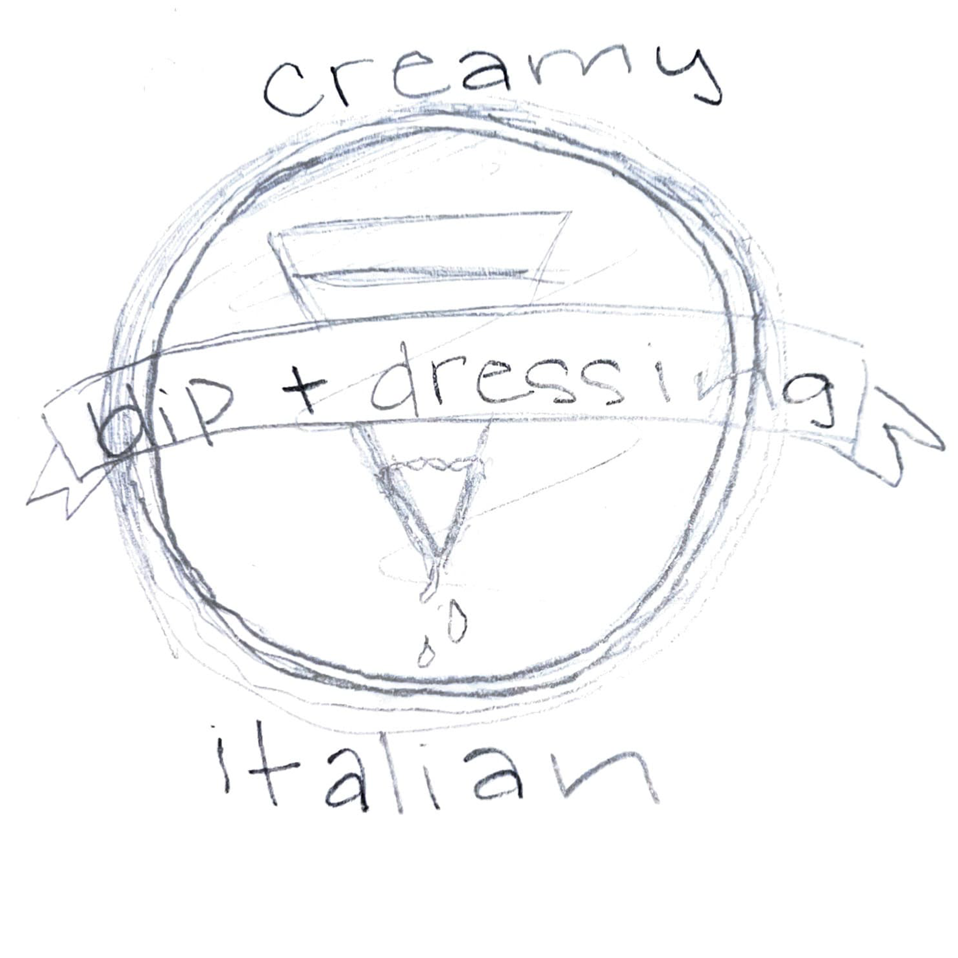
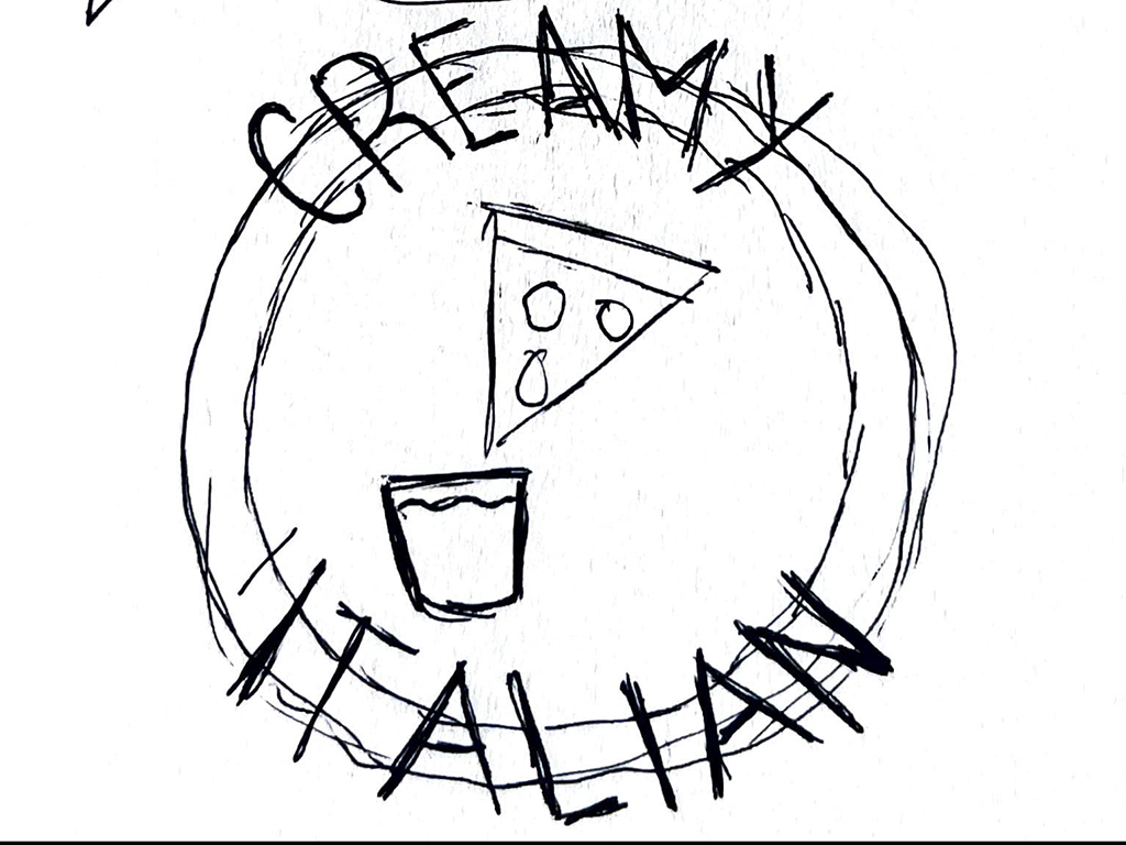
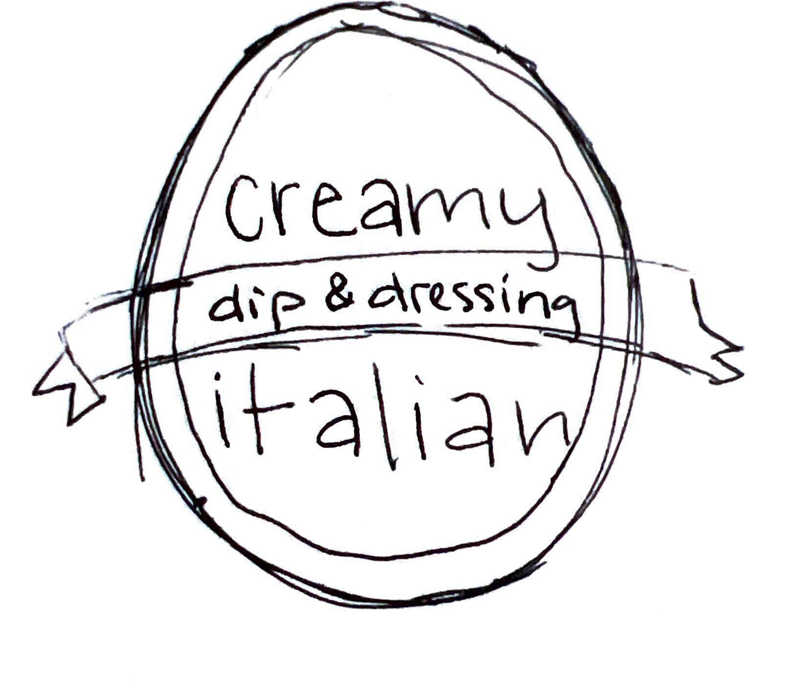
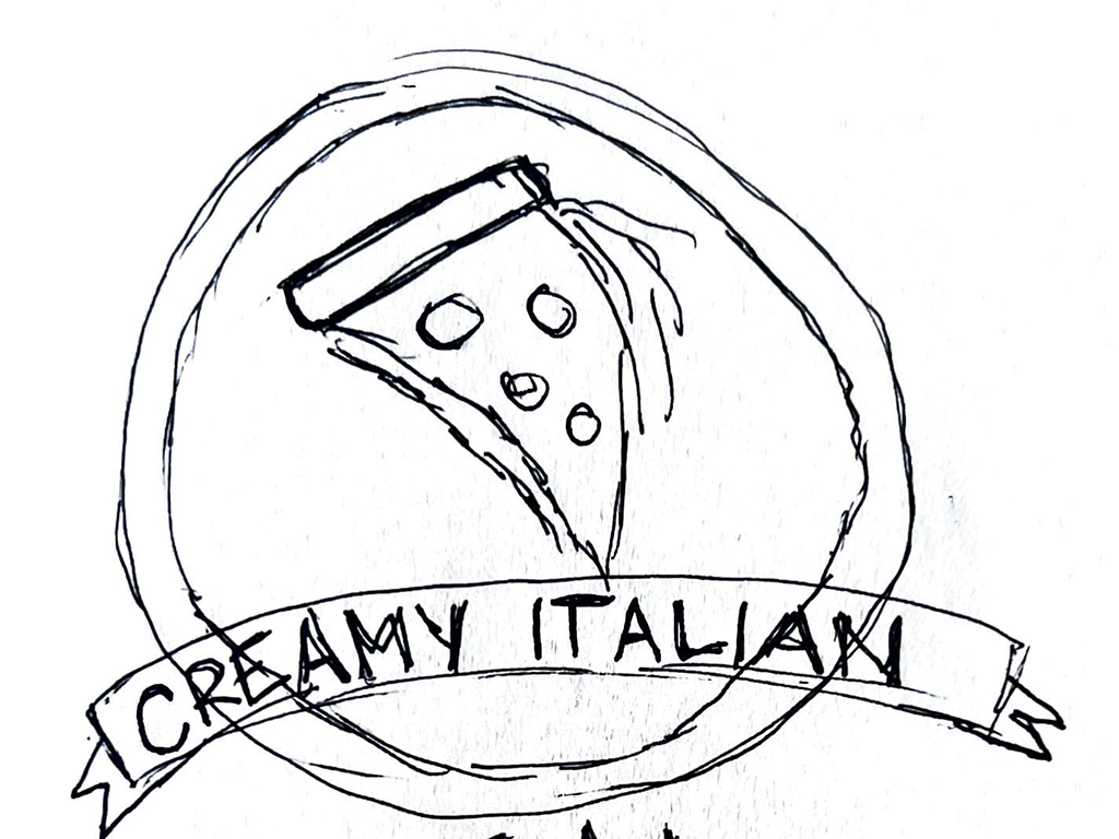
The project began with research into existing condiment and dressing packaging, focusing on brand messaging. I sketched initial concepts that explored different shapes, labeling systems, and closure mechanisms.
Digital Iterations
I turned my sketches into digital drafts using Illustrator and 3D modeling. I tested different designs using bold pizza-inspired colors and logo placement. From these iterations, I refined the design into a sleek bottle logo design.
Final Iteration
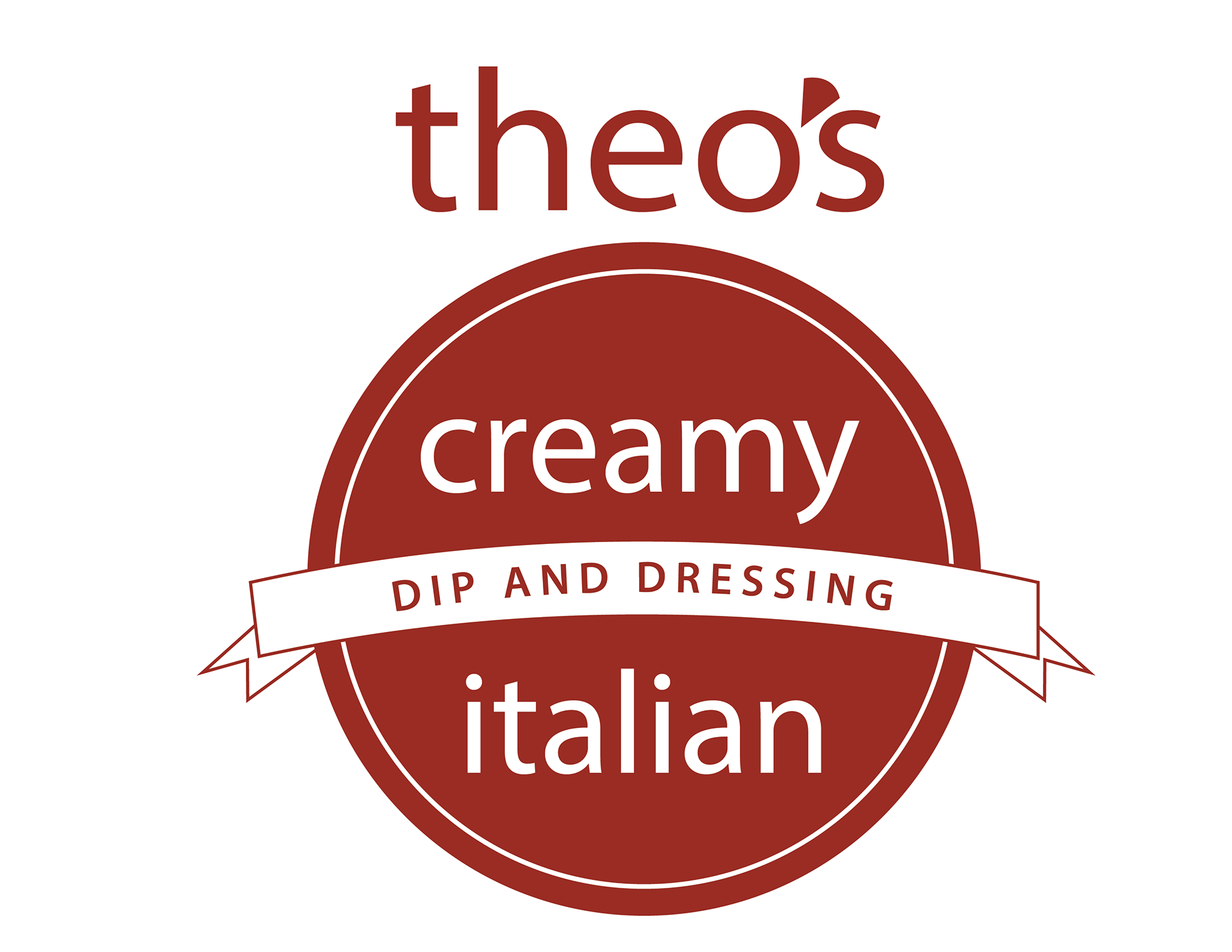
The final bottle design ensures both usability and brand recognition. The final label uses vibrant pizza-inspired colors and dynamic typography, creating an eye-catching shelf presence and strong brand consistency.
Final Application

